A while ago I talked about creating icons for Dynamics CRM for CRM 4 and 2011. I thought it was time for an update and some tips on creating those metro-like icons.
Tanguy’s Toolbox
Tanguy Touzard, CRM MVP and tool-maker extraordinaire has a toolbox which any developer or administrator should not be without. Here it is and it makes a whole series of common tasks so much easier. The one that is useful for icons is the Iconator.
Using the Iconator we can get our entities from our organization, see which ones need icons, click the ‘Add Images’ button at add our 16x16 and 32x32 images and then map them to our entities.
The Iconator takes care of creating our web resources for us, publish our changes and even allows us to automatically add the web resources to a pre-existing solution in our organization.
Use it and if it saves you a bit of time, feel free to click the Donate button and keep Tanguy in croissants and champagne.
Creating the Images With GIMP
GIMP (GNU Image Manipulation Program) is an open source image editor comparable to Photoshop and much cheaper (it is free). Here is the link to download it.
Once loaded, you can manipulate images like a pro, once you get used to it.
An Example of Making an Icon
Let us take a picture and convert it into a couple of CRM icons. There are plenty you can get inspiration from on the internet but, to avoid any copyright entanglements, I will use one of my own.
This was a photo I took at the EMP Museum in Seattle where you stand in silhouette and the screen adds horns and tentacles to you. I caught this image before it did me too much damage.
Loading it into GIMP, the first thing I want to do is eliminate the color. I can do this one of two ways; either by selecting Image – Mode – Grayscale or Colors – Hue-Saturation and put the Saturation down to 0. If GIMP complains that you can only adjust RGB images, this is set as part of the Image – Mode settings.
Next I am going to make it black and white. This is done with the Colors – Brightness-Contrast settings. Contrast goes to max and Brightness, as required. Below, I simply put Contrast up to the maximum value.
Next I will isolate the part of the picture I want for my icons with the rectangular select. This is found as the first icon in the toolbox window of GIMP. Once selected, you pick Image – Crop To Selection. Do not worry if your selection is not perfectly square; we can fix this later.
Next we will want the background to be transparent. To do this, we go to Colors – Color to Alpha and hit OK. Our background is now transparent.
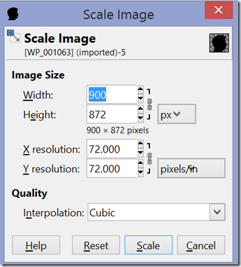
We can tweak, as required, possibly invert (Colors - Invert) and when happy we adjust the size. To do this we go to Image – Scale Image and make it 32x32 px. We may need to click on the chain to break the ratio and make it perfectly square.
When adjusted, you will have your first icon ready.
To save this, go to File – Export As and save it as a png (you specify the type by simply typing in the extension e.g. ‘leon.png’). Once done, go back to the image, rescale to 16x16 px and export again. You now have two images ready for CRM.
Conclusions
Using GIMP and these simple techniques, many icons can be created from simple, readily available images. Maximising the contrast will even eliminate gray watermarks if you have an image you can use with such an artefact on it. Once created, you can add these to CRM or any other program needing icons. Their simple, flat design are also compatible with Microsoft’s metro paradigm. Good luck and feel free to explore the many features GIMP offers.


3 comments:
Leon, have you figured out what the best way to handle the "sometimes light, sometimes dark, sometimes green" background for CRM 2013 Icons (esp. on Custom Entities)?
Feel like my light icons get lost against the white/light grey backgrounds, dark get lost against the navy blue backgrounds, and middle grey are indistinguishable against the green background in the nav/command bar. Quite aggravating.
Hi Joe,
No good answers for that one. I make mine black but if they're getting lost in the background you could skip the invisible background step to force a white box around your icon, although it may look a little awkward elsewhere.
Leon
Hi Leon,
After much consternation, I have arrived at what I think is my favorite approach for the background Icon quandary: use brick red (or any other red, but softening the red value to ~210 seems to make it easier on the eyes).
Red stands out from both dark and light backgrounds and compresses to 16x16 pretty easily.
Just thought you might like to know what I found.
Cheers,
Joe
Post a Comment