I upgraded my Surface Pro 128Gb this weekend so I thought I would share my experiences and thoughts on whether others should follow suit. In short, take the usual precautions and then go for it.
When Will My Surface Auto-Update?
I was waiting and waiting for Windows Update to apply the upgrade but it does not work that way. The Windows 8.1 patch/update does not come down to the Surface Pro automatically but, if you go to the Store, it should be the first giant window you see.

You install it like any other app. The main difference being it is a big download; 3Gb of big. I have seen complaints about this on the web saying how Apple would never release such a large patch etc. To be honest, never having owned an Apple computer, iPhone or iPad, I have no idea how stream-lined and floral-scented the Apple upgrade path process is.
For myself, as the big download happened in the background, it was not a big deal; I started it in the morning and a few hours later (our internet is not the fastest in Australia) it told me it was going to reboot in 15 minutes and get the process going. I finished playing my level on “Where’s My Water 2” and rebooted.
I have read about people having a few issues with the upgrade on general PCs so, obviously, back up before applying the upgrade. I had a file backup from a few weeks ago so, for me, this was good enough.
My biggest concern was hard drive space; Of the 128Gb, I was down to 10Gb. For those that have seen my other Surface reviews, when I first got the machine, at the end of February this year, after installing the essentials, I was down to 50Gb of free space. By June, this was at 20Gb. With the space going, it looked like I would be purchasing a Surface 2 before the end of the year. Thankfully, the upgrade to Windows 8.1 has literally saved me hundreds of dollars by putting off this looming apocalypse.
Windows 8.1 Frees Up Space
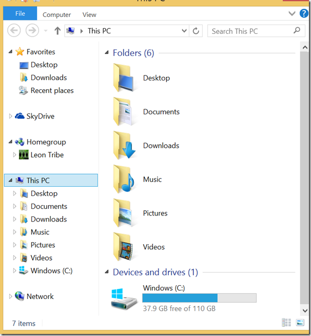
This is my hard drive as we speak.

I now have almost 40Gb of free space on the hard drive! Upgrading to Windows 8.1 has made close to 30Gb appear out of nowhere. So what has happened?
Unfortunately I did not screenshot pre-upgrade because I was not expecting such a dramatic change. To be honest I thought I would be down to 5Gb and looking to jettison old iso and avi files but this was not the case.
The best we have is my June screenshot where I was at 22Gb of free space. The main folders which are smaller since then are the Users folders (reducing in size by about 4Gb), the Windows folder (also reducing by about 4Gb), ProgramData has lost about 6Gb and System Volume Information has gone down about 3Gb (22Gb+4Gb+4Gb+6Gb+3Gb = 39Gb). The User directory is mostly my profile account. I had sorted through about half of my 10G of unsorted files so this is probably where this space gain came from.
The Windows folder, I assume, is because Windows 8.1 does some spring cleaning with the upgrade. The Avast! antivirus logs had been reduced since June so this could explain the reduction in the ProgramData folder. Finally, I do not have a solid idea why the System Volume Information is smaller. I do see that the SystemRestore sub-folder is empty so, perhaps, again, this is some spring cleaning.
The amount of free space has fluctuated between the high and low thirties over the past 24 hours but this is still a lot better than 10G.
The Actual Upgrade Process
On my Surface Pro, this was painless, although it did take a while (presumably, in part, due to the freeing of 30G of space). You will see a lot of spinning dots, percentage counters slowly increasing, a few reboots and some cutesy commentary like “Fixing up a few more things”. Once this is all done you should be good to go. I did not time the process but set aside an hour and you should be ok.
Any Problems?
Problems were minor. Firstly, the pretty, stylised picture of Seattle has gone from my lock screen and replaced with some brightly coloured concentric circles (although the old picture can be restored in settings). Also, my desktop picture has been replaced. The other issue is my Windows Phone is now displaying the old Live ID icon for my details rather than my previous Facebook icon, which it had shown pre-upgrade. I assume this is a ‘last change wins’ issue and, if I go to Facebook and re-apply my ‘table dancing’ icon, it will sync to the phone.
I have not adjusted any of the ‘issues’ yet because, frankly, none are a big deal for me.
Finally, some of my Metro applications no longer work. None of these were essential or even regularly accessed and so I have simply uninstalled them and not given it a second thought.
What Has Changed?
I have already mentioned the space which has appeared. Fellow CRM MVP Joel Lindstrom believes it is due, in part, to the changes with the way Windows 8.1 uses SkyDrive. For existing users of the SkyDrive application, nothing has really changed as you still have your SkyDrive folder.

The biggest difference for me was, before, I could only add a limited number of folders to my SkyDrive folder because there was no choice but to sync them down to the local drive (unless you accessed them via Internet Explorer or the Metro SkyDrive app.) Now, with windows 8.1, all folders are visible under the Skydrive folder but are all virtual cloud folders (except ones you were syncing locally, pre-upgrade). You can right-click on a folder to make it sync locally but I will probably only do this on an as-needed basis.
This change means it is much easier for me to manage my SkyDrive content from the File Manager. For example, it is quite difficult to manage the space your SkyDrive account is taking up through the web client or Metro app and with only certain folders being synced locally, pre-upgrade, it meant this also did not give me visibility of the files in my account. Now I can run my TreeSize application and manage SkyDrive as if it was just another drive. Prior to upgrade, I used my son’s computer to store a full local backup of my SkyDrive, via the SkyDrive application, so I could manage the space. This will no longer be necessary.
You may also know that the Start button is back. I had installed a Start button emulator prior to upgrading, which I uninstalled before going to Windows 8.1 but the new one covers the essentials. The new start button does not bring a lot to the table and is equivalent to hitting the Windows button when you pen-tap or left-click it and is equivalent to the Windows 8 Windows-X when you right-click it. I still welcome its return though.
The upgrade also comes with a new version of Internet Explorer (version 11). While recently abandoning IE10 for Firefox, I find myself, again, giving Microsoft one more chance, switching my default back to IE. No freezes or crashes so far but my IFD CRM 2011 instance does not like it, showing me the Express client rather than the normal web client. I assume a rollup will come to the rescue on this one.
Finally, you can, like in a Windows phone, adjust the size of the tiles in the Metro screen (the tile settings are now accessible in the same way as the Windows Phone i.e. press and hold, rather than down-drag and release). You can make tiles really big or tiny. I like this flexibility but, like my Windows Phone, it is not always obvious whether a tile is active or not, without sitting there to see if it changes. Because of this, it is not always obvious what the optimal size for a tile should be (do I make it small and miss out on tile notifications, or bigger, wasting real estate just in case it wants to tell me something?). A suggestion for Metro app makers; provide information or a setting to optimise the tile size to ensure the best user experience. I did notice the dragging around of tiles is greatly improved and less ‘shaky’ than it was in Windows 8.
Conclusions
I say if you are running a Surface Pro and have the spare 3G of space, go for it. Obviously, back up your data and make a note of the applications you have installed (checking online if there are critical ones which you may think will not survive the process). My experience has been almost exclusively positive and, with my additional hard drive space, I can spend my money on other things than a premature machine upgrade.


